Client
Co-operty
Services
Brand Rolllout
Graphic Design
Print Design
Print Services
Year
2023
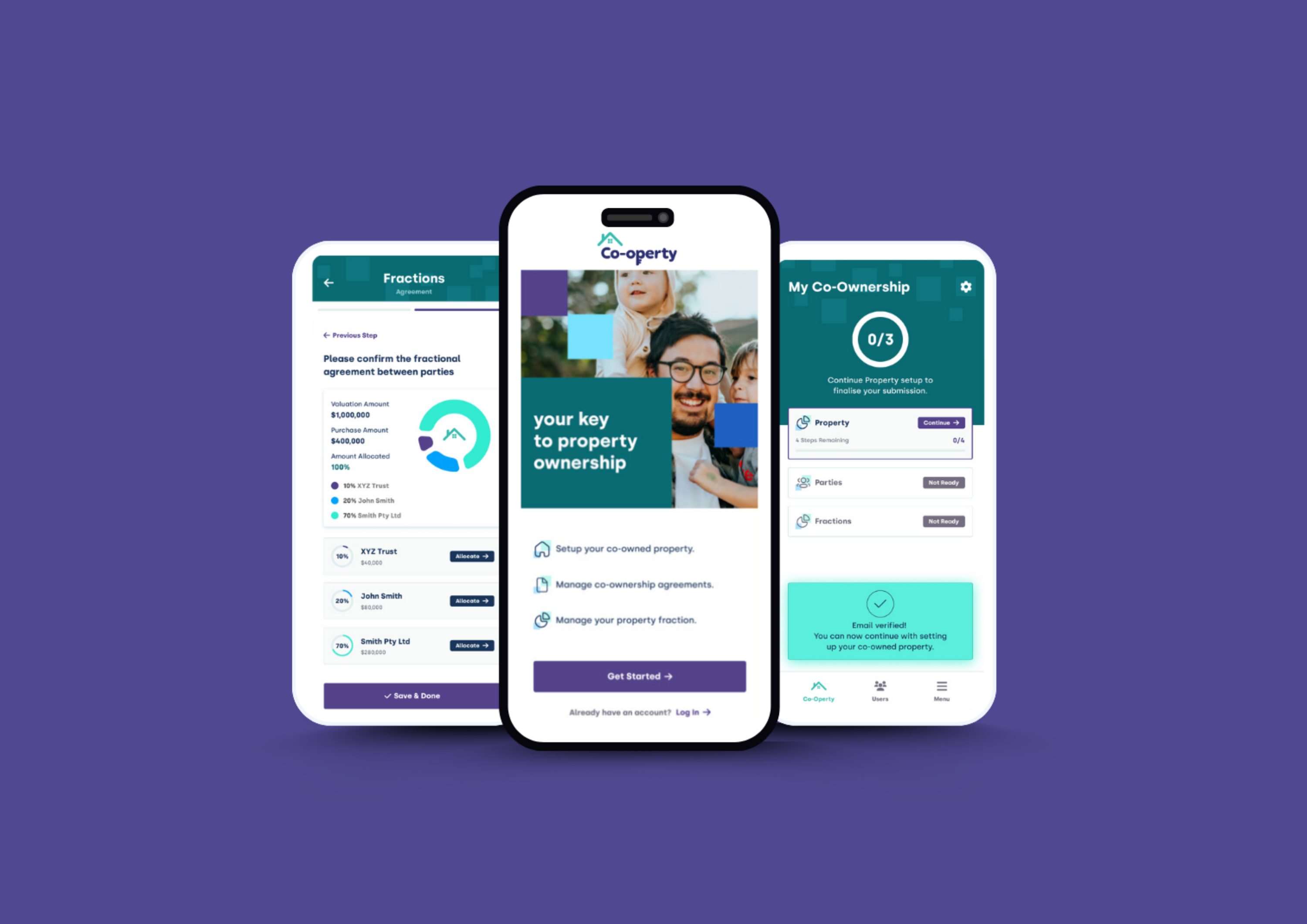
D&Co Studio had the privilege of collaborating with Co-operty, a visionary organization committed to realizing the Australian dream of home ownership for the next generation through innovative co-ownership solutions. Co-operty approached us with a well-defined brand identity but sought our expertise in crafting a compelling visual language to convey their unique brand story across various marketing materials.
One of our key contributions to Co-operty’s brand evolution was the development of a distinctive brand color palette. Comprising violet, bottle green, navy blue, and sky blue, this palette was carefully chosen to set Co-operty apart in the market, fostering brand recognition and resonance. The selected colors reflect both professionalism and approachability, aligning seamlessly with the organization’s mission of making home ownership accessible to all Australians.
In addition to the colour palette, we integrated a symbolic element into the visual language – the use of squares. These squares serve as a visual metaphor, representing the “building” of a home and encapsulating the essence of the Australian dream. This thoughtful incorporation aligns with Co-operty’s mission and adds depth to their brand narrative, making the visual language more meaningful and resonant.
Co-operty’s core message, centered around enabling home ownership through co-ownership, resonates strongly with their audience. Our design work aimed to amplify this message by creating a visual identity that not only communicates professionalism and trust but also reflects the shared property adventure that Co-operty offers. The design elements, including the color palette and symbolic boxes, work harmoniously to convey the brand’s commitment to making co-ownership easy and accessible for everyone.
Co-operty’s mission is articulated through three key pillars: making property ownership more affordable, unlocking equity responsibly, and unlocking property supply in desirable areas. Our design choices were guided by these pillars, ensuring that the visual language reinforces these core principles and communicates them effectively to the target audience.
In summary, D&Co Studio is proud to have played a role in enhancing Co-operty’s brand presence and visual identity. Our collaboration aimed to not only meet the client’s design needs but also to contribute meaningfully to the broader narrative of Co-operty’s mission – making the dream of home ownership a reality for all Australians through the power of co-ownership.